Driver Application
Facilitating seamless passenger transportation from point A to Z.
Role: UI/UX Design, Visual Design
Tools: Adobe XD, Photoshop, Illustrator, Miro, Jira
Overview
Our drivers rely on software for passenger safety and smooth transportation. Its accuracy, user-friendly design, and flawless performance are essential for our carriers, guaranteeing a seamless travel experience and fostering customer loyalty.
The current app lacks detailed passenger information, leading to instances of confusion such as when drivers pick up more passengers than expected. We must provide clear passenger info for any discrepancies in passenger numbers, as to guide drivers in decision-making during trips.
Problem
Interface isn't very intuitive for the non-tech savvy user.
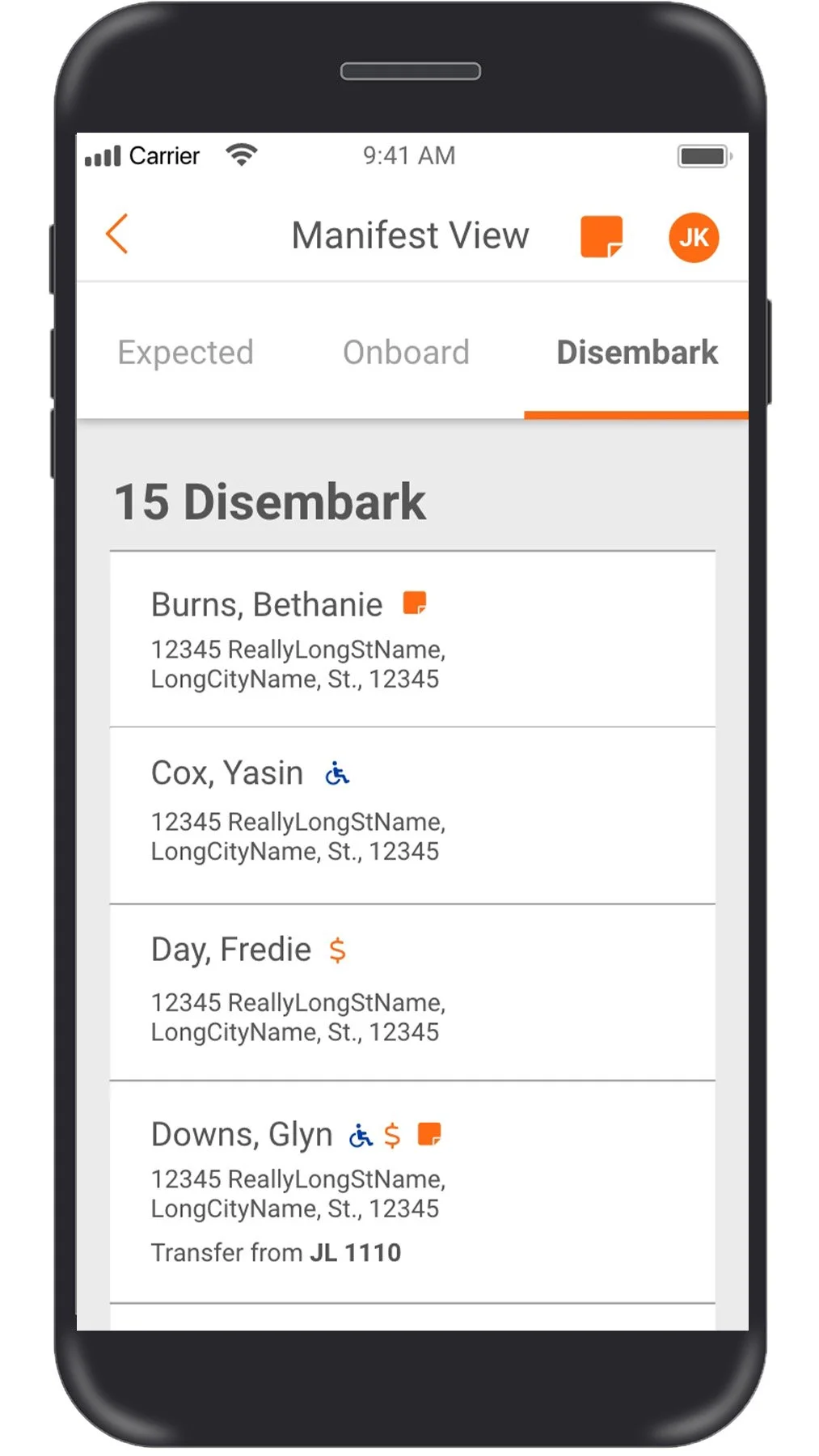
Passengers coming in as transfers from canceled bus pick ups need to be indicated as such
Unable to quickly see who are ADA requirements
Solution
Detailed view of passengers expected to get on, or transferring in and ones that rescheduled.
Present prompts that provide reasoning to why passengers could not get on.
Aim to give bus drivers confidence in their decisions with step-by-step prompts.
User Flow
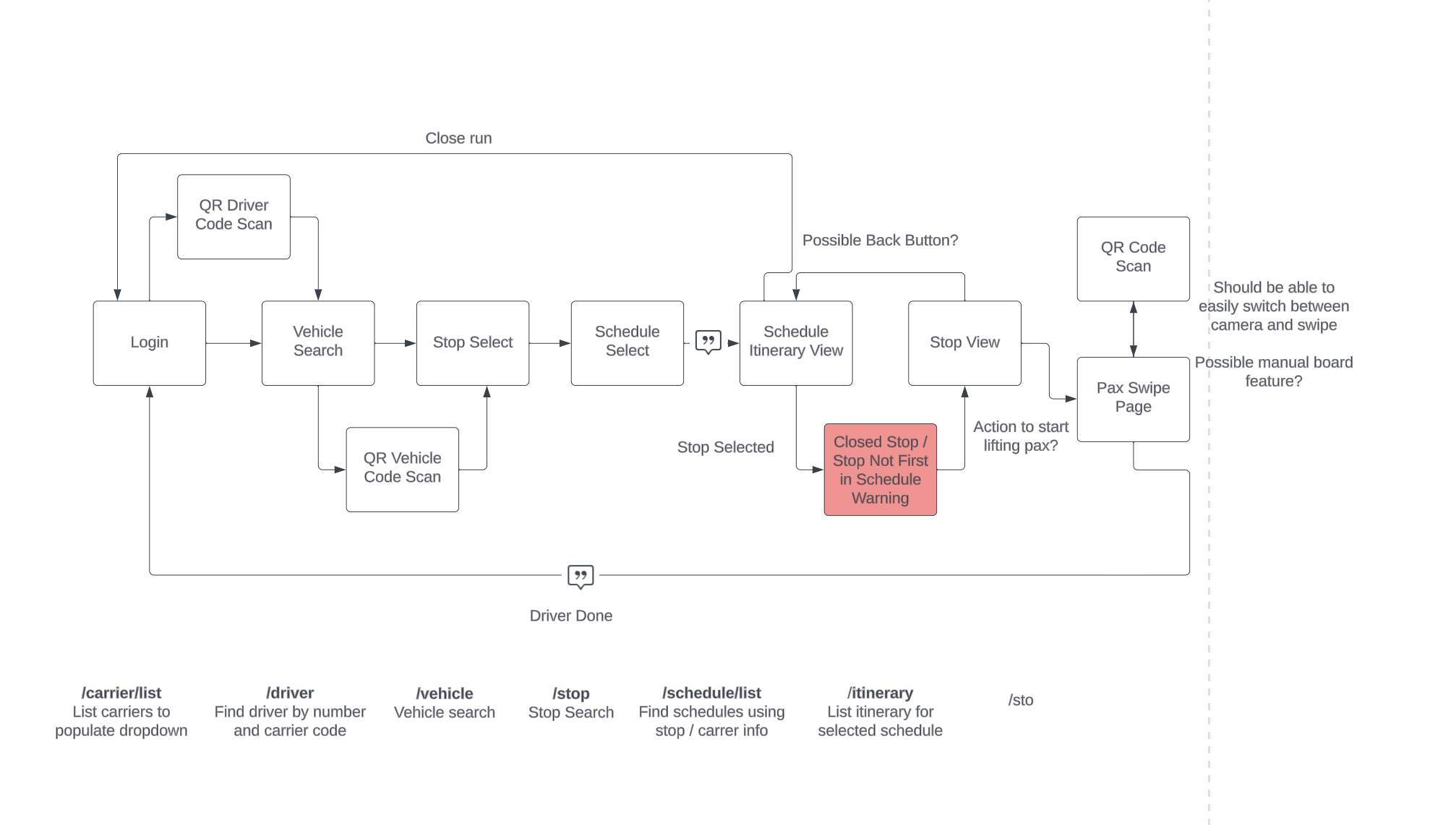
In revamping the design, my initial step was to comprehend the journey of our drivers when they engage in the process of "lifting" tickets. Following a thorough analysis of the flow, we designed an improved version that streamlined the tasks into one and augmented the intelligence of the application
Task 1
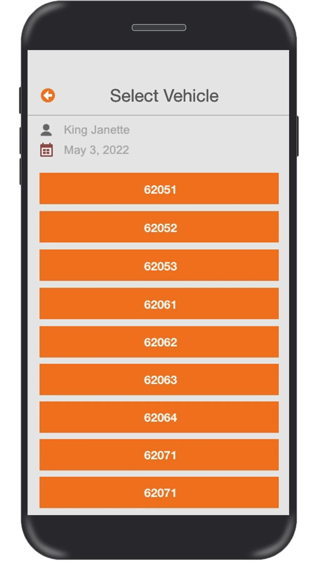
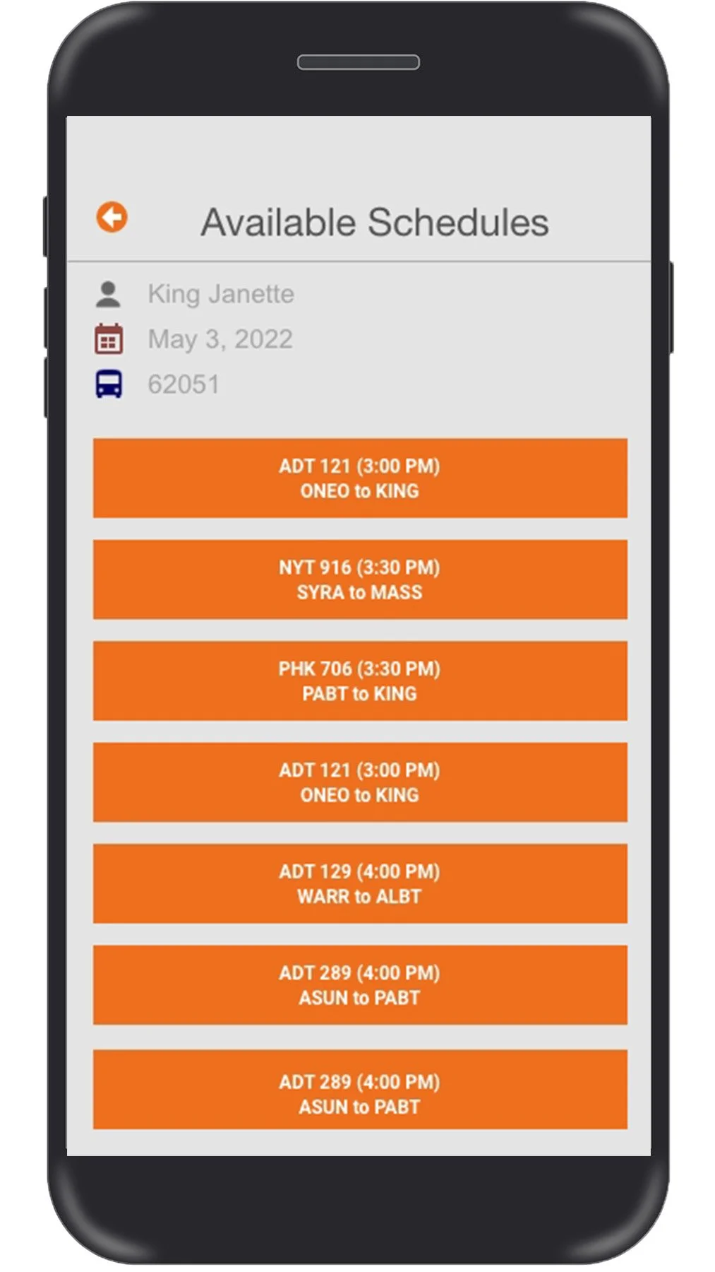
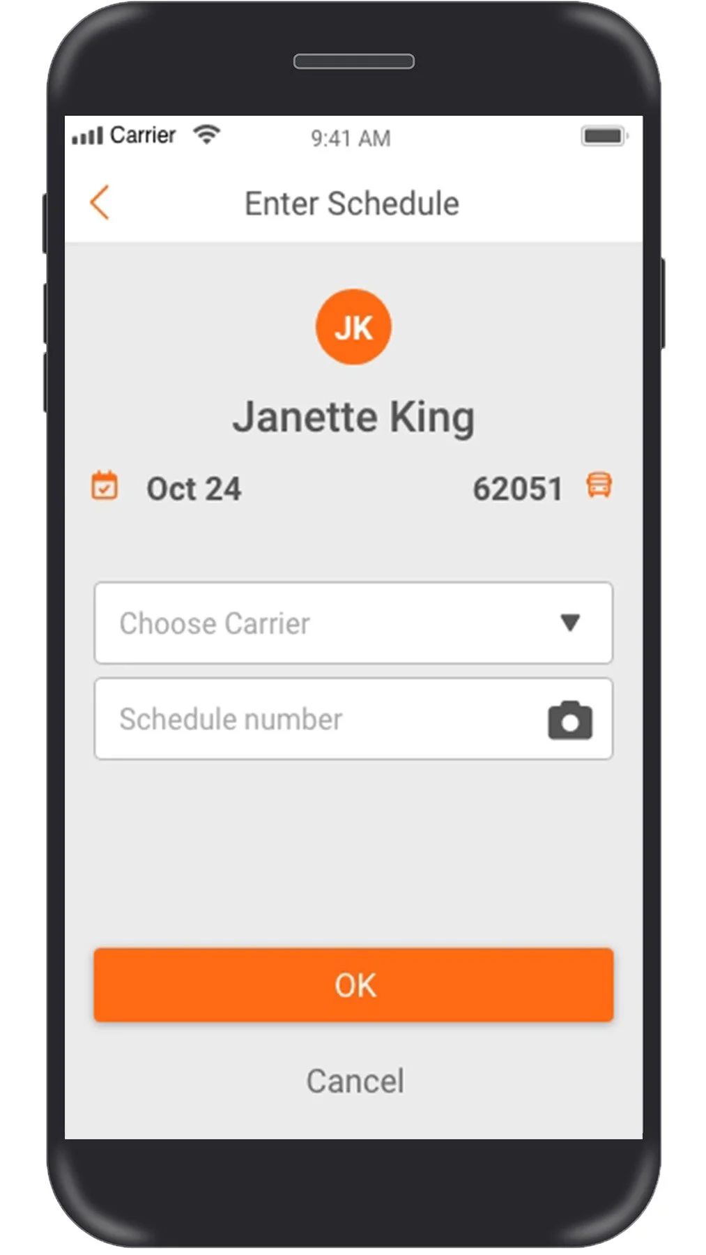
The first thing I wanted to tackle was how to make the log in process for our drivers more smart and efficient. In the previous version of the driver app, the login process for operators was time-consuming. They were required to sift through an extensive list to choose their vehicle, and then find the number for that day's schedule.
Before
Solution
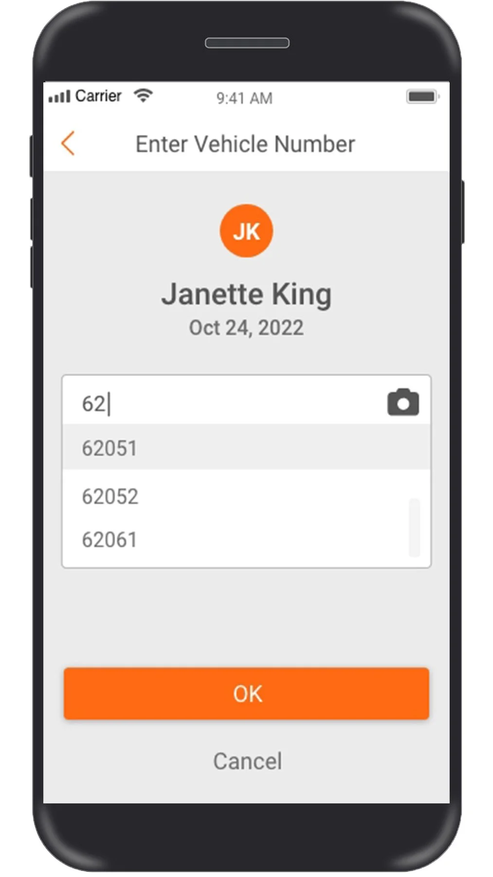
We've enhanced its intelligence by permitting drivers to locate their vehicle and schedules by allowing them to either scan or search with a handful of characters. This display now provides a dropdown menu that doesn't occupy the entire screen. Delivering an uncluttered appearance, it simplifies the process of taking in all the information displayed on the screen.
After
Task 2
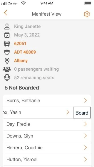
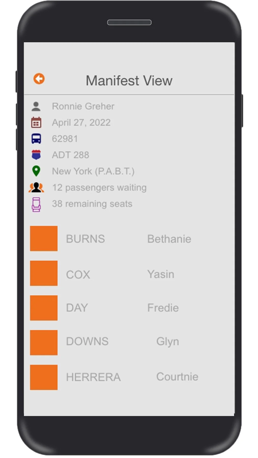
The manifest display was cluttered with information, ironically offering no clarity about the passengers queued for pick-up, those departing, ones who missed their stop, or simply an existing tally of passengers at the stop.
Before
Iterations
I wanted to make sure I covered all the possible ideas, I sketched out my ideas and created wireframes. These were some of the ideas that made it to final stages of prototyping.
Solution
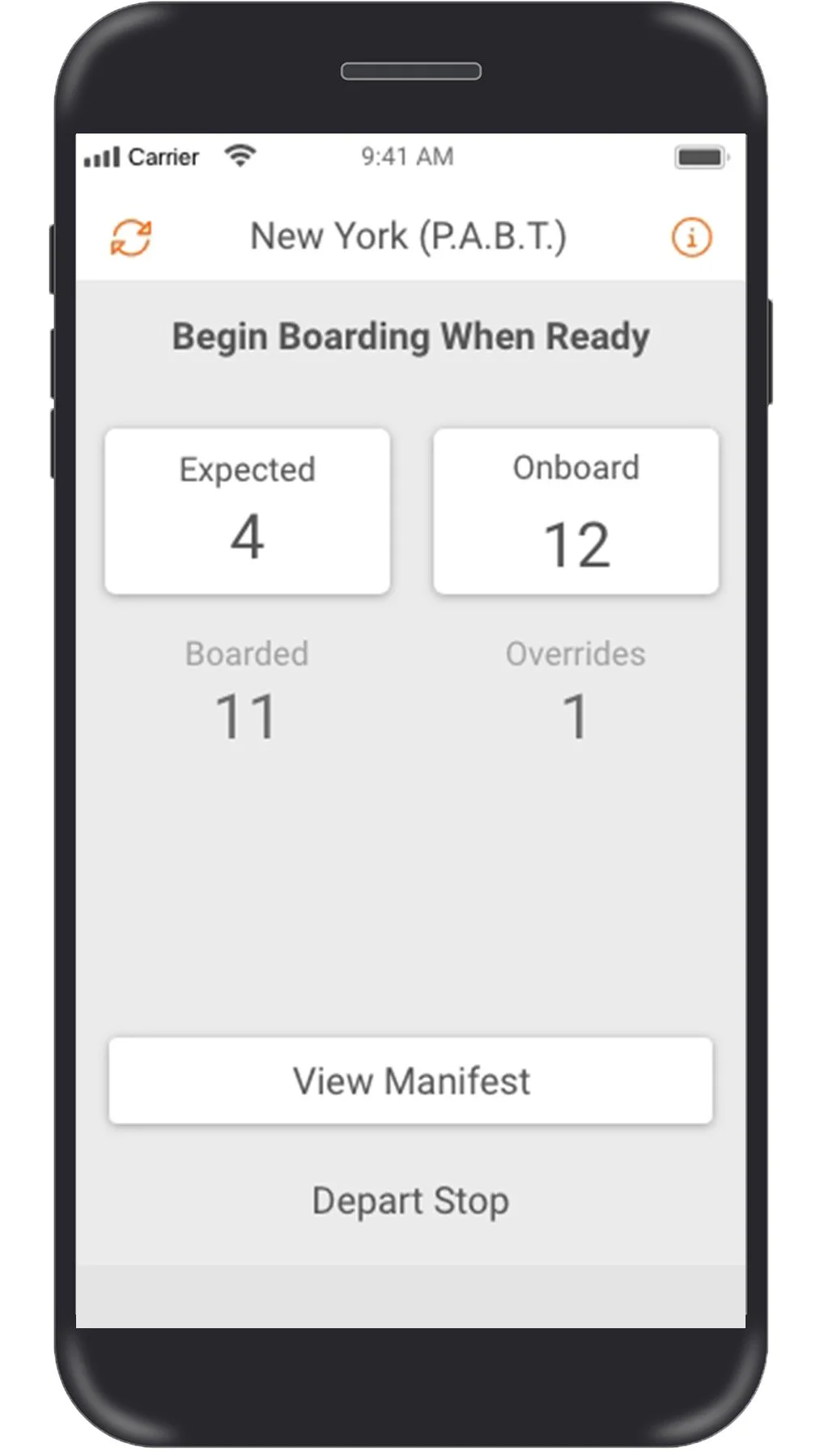
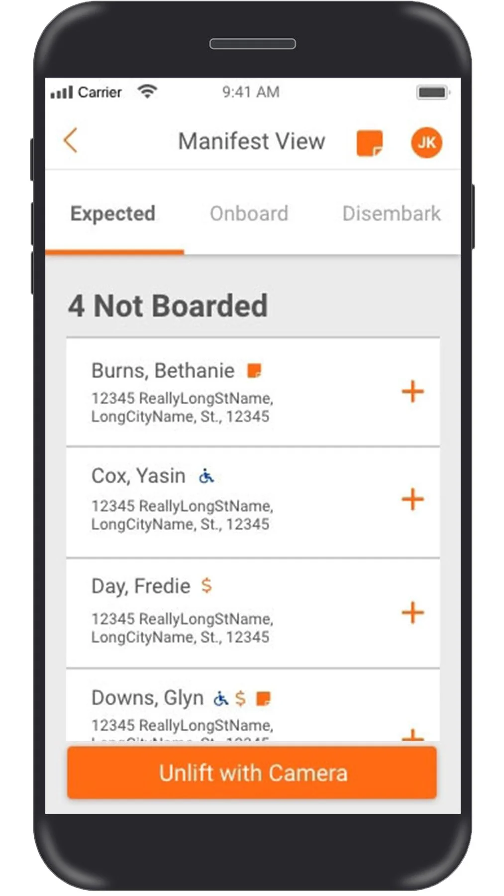
I've created a fresh visual aid for summarizing passenger activity as they embark on the bus at individual stops along the route. I've divided the boarding data into four distinct sections: anticipated boardings, passengers already on board, recent arrivals, and conditional scenarios.
In the itinerary view, operators can conveniently see on each stop tile in green the number of expected riders and red for disembarking individuals.
After
Problem 3
Once again, with the previous driver application, we overlooked a chance to gather more information about the passengers getting on at this station. Who requires accessibility aid? Who was unable to pay for the trip due to an online ticket rebooking and needs to pay in cash? If a passenger has a note for the driver, how do we communicate that message?
Before
Solution
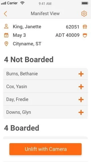
I've restructured the display of the entire passenger list on a separate screen. Maintaining uniformity, I incorporated tabs for a swift display of expected, presently onboard, and disembarking passengers. In the roster of passengers on the manifest, we've now added specific icons as guidance for our drivers pertaining to every passenger. For instance, an ADA icon is displayed for passengers requiring wheelchair assistance, and a dollar sign icon indicates money due for collection.
After
Takeaways
Developing this app for drivers was an enlightening experience. It deepened my understanding of design intricacies, especially for smaller screens, and had me consistently think about the users interaction with the product and strategies to streamline it.
It's crucial to continuously verify at each stage of development to ensure the desired outcome. Little things that are frequently unnoticed can significantly influence our users' experience.
Gained much insight on maintaining uniformity in designs to prevent user shock upon encountering unexpected elements.
Crafting for a compact display, my considerations had to include the dimensions of elements such as fonts and buttons.
Conclusion
The initial stage of the novel driver application that my team created is complete, but we continue to refine it. With each added feature, we enhance its accessibility, ensuring the application becomes increasingly user-oriented.


