Nav Website Redesign
A comprehensive bus route guide mapping the networks of carriers across the country
Role: UX/UI Design, Visual Design
Tools: Adobe XD, Jira, Illustrator, Miro
Overview
NABT (North American Bus Timetables) Guide stands as a pivotal tool utilized by carriers nationwide, fostering collaborative efforts among businesses to facilitate seamless transportation solutions for customers.
Problem
Updating interface to align with current brand identity.
Currently, there is no way to view the Map Display and NABT Guide.
The table design that shows available schedules lacks clear hierarchy, making it difficult to quickly grasp the information presented.
Solution
Follow the brand identity for a cohesive look of the products
Create a landing page to toggle between the two views
Enhance clarity by introducing icons and colors to the table design, aiding for easier absorption of information.
Kick Off
We had a kick off meeting with the project manager and developer to ensure a comprehensive understanding of stakeholder requirements and project expectations. Consensus was reached on the necessity for design consistency with established brand guidelines to achieve a unified aesthetic across all products.
Ideation
I began the process by creating wireframes to strategically organize all details and conceptualize the placement of information. This approach provided us with a holistic view of the user journey and allowed us to maintain a user-centric focus throughout the design process.
Task 1
The landing page lacked visual appeal and appeared devoid of design elements. The layout required both functionality and a sense of reliability to instill confidence in users.
The Table Lookup section was positioned far left on the page, leaving excessive white space on the right of the screen. I wanted to transform the landing page into a dynamic and engaging hub to capture the essence of the application's importance.
Before
Solution
I opted to center-align the form to create a true landing page feel and to use the space. This gave the Table Lookup more prominence. To provide users with flexibility and options, I implemented a toggle feature allowing them to seamlessly switch between map and table views, offering two distinct perspectives.
When considering the design, our user demographic skewed towards an older audience, leading me to prioritize familiarity over experimentation. I opted to maintain square toggle buttons as they inherently provided a sense of recognizability and affordance, ensuring a user-friendly interface.
After
Task 2
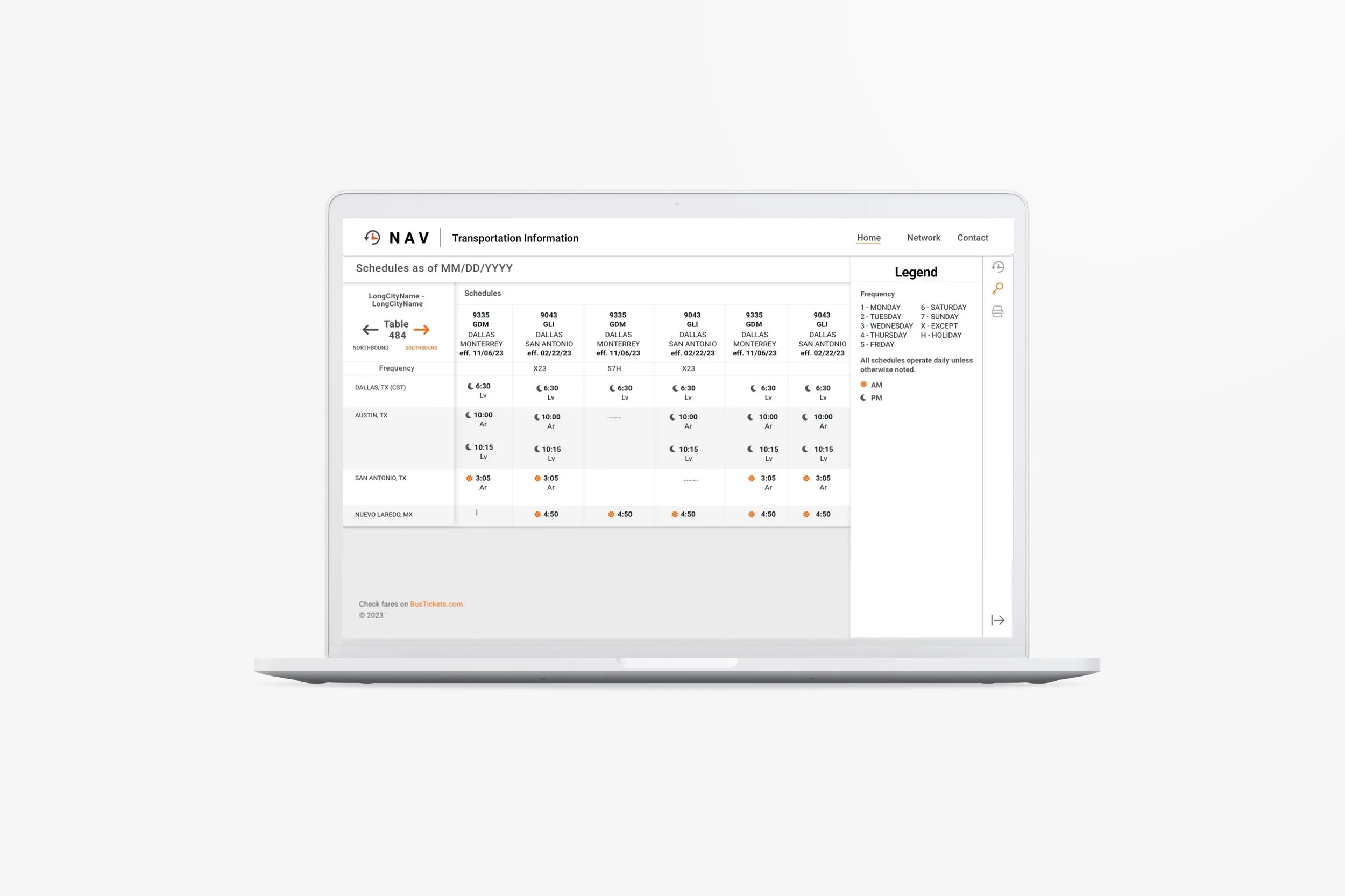
One of the key challenges with this page was the fixed order of information within the table, making it a challenge to optimize the hierarchy for better readability. Additionally, the placement of the legend and print options at the bottom felt disjointed and disconnected, almost as if they were floating freely.
The use of bold font posed challenges in distinguishing important information such as directions (Southbound or Northbound) and distinguishing between AM and PM times. It was somewhat excessive and could be improved for clarity.
Before
Solution
Incorporating color became the primary solution for the table design, given the constraint of not being able to rearrange information. To differentiate between AM and PM times, we utilized icons – a sun for AM and a moon for PM. This simple visual cue allows for quick and clear identification of the schedule without any ambiguity.
Additionally, the table was designed with a two-toned color scheme to enhance readability, especially for longer schedules. This approach ensures that the information is easily distinguishable across the entire table, providing users with a clear and efficient way to navigate the schedule.
After
Task 3
The legend presented an issue as it expanded and occupied an awkward portion at the bottom of the page. Upon review, we found that many listed items were no longer necessary or utilized. It became evident that a cleanup and update were necessary to align the legend with the new icons and color coding implemented in the table design.
Solution
I moved the legend to the right side where the table lookup form lives. The legend has its own button to centralize all interactive elements. By clicking the key icon, users could seamlessly switch between the form view and the legend, ensuring easy access to all available actions within this focused area. This approach maintains the static schedule view while providing instant access to essential information.
During this update, we eliminated unnecessary information that was no longer relevant, streamlining the legend to align with the updated icons and color coding in the table design. This resulted in a cleaner, more efficient user experience with clear, concise guidance.
After
Takeaways
This redesign project provided a unique opportunity for me to delve into my creativity, particularly given the significant constraints on what could be altered. I found the challenge invigorating, and I believe the result reflects a clean and simple design that enhances user experience.
Even subtle changes, such as color adjustments and the addition of icons for visual cues, had a profound impact. These small yet strategic alterations not only improved the site's appeal but also made information more easily accessible. The design now offers a more visually appealing and user-friendly interface, allowing users to navigate and access information with greater ease.


